Website
Elixus Agency
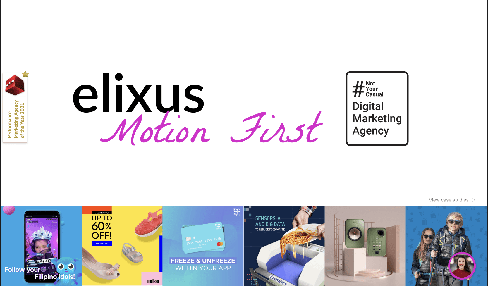


Overview
Elixus Agency is a performance-driven global digital marketing firm working with brands across Southeast Asia. Their previous website did not reflect their updated capabilities, creative direction, or scale. The design felt dated, cluttered, and inconsistent—limiting the agency’s ability to showcase credibility, drive conversions, and communicate their unique “Motion First” identity.
I was brought in to redesign the website, giving it a more modern, bold, and conversion-friendly visual system while improving content hierarchy and overall usability.
Challenge
The original Elixus site faced several issues that affected user engagement and brand perception:
Outdated visual design that no longer aligned with the agency’s evolving brand
Weak hierarchy, making it difficult for visitors to understand the agency’s services
Poor storytelling around case studies, results, and social proof
Inconsistent typography and spacing, creating visual noise
Generic landing experience that didn’t differentiate Elixus from other agencies
Limited conversion cues and unclear pathways to contact the team
Elixus needed a redesign that would express their creativity, global presence, performance-driven mindset, and client success stories.
Goal
Redesign the website to:
Modernize the visual identity with vibrant gradients and motion-inspired elements
Strengthen credibility with clearer case studies, results, and partner logos
Improve service communication with a structured, scannable IA
Increase conversions through prominent CTAs and streamlined flow
Build a cohesive design system that the team can scale across pages
Solution
1. Modern Visual Identity
The redesign introduced a bold, gradient-rich aesthetic aligned with Elixus’ “Motion First” brand.
Key updates included:
High-impact hero section with kinetic typography
Vibrant color transitions to create visual energy
Clean, modular card layouts for case studies and services
Fresh iconography and refined typography for clarity
2. Clearer Service Breakdown
A segmented service menu allowed users to understand Elixus’ offerings at a glance—covering Performance Marketing, CRM, Analytics, SEO, Content, and more.
This improved both navigation and message clarity.
3. Stronger Social Proof & Partnerships
Logos of world-renowned partners (TikTok, Meta, Google, LinkedIn, etc.) were elevated to enhance trust.
4. Case Studies Reimagined
High-performing campaigns were showcased using modern card layouts, direct result metrics, and clean CTAs, turning case studies into conversion assets rather than static content.
5. Conversion-Optimized Layout
Clear CTAs (“Get in Touch,” “Speak to Our Lead Agents”) placed strategically
Logical flow from brand story → services → clients → case studies → contact
Footer redesigned for quick access to contact details and legal information
Outcome
The revamped Elixus website now presents a more compelling, modern, and credible agency identity. The clean layout, bold visual direction, and improved information hierarchy provide:
A stronger first impression for new visitors
Increased clarity in service offerings
Better storytelling for client successes
Improved conversion pathways
A scalable design system for future updates
The redesign successfully positions Elixus as a contemporary, high-performing digital agency in a competitive market.

Ally Lilith
Currently based in Malaysia · Available for global collaborations. (Timezone MYT/GMT+8)
•
2025 / allylilith.com
•
•
2025 / allylilith.com
•